Survey data analysis, like any scientific discipline, follows a strict step-by-step procedure. Each stage necessitates a unique set of skills and knowledge. To gain meaningful insights, however, it is necessary to comprehend the entire process. A solid foundation is essential for producing results that can withstand scrutiny.
Your online surveys have yielded results. Now is the time to harness the power of survey data analysis to make sense of the findings and present them in ways that are simple to understand and actionable. After you’ve gathered statistical survey results and developed a data analysis strategy, it’s time to start interpreting the survey results you received.
This article explains how our expert researchers interpret quantitative data (versus qualitative data). They base their reporting on survey responses that provide answers to research questions. Even for experts, it can be difficult to extract insights from raw data. This is why the best hands must handle this part of the project.
To achieve your survey objectives, you should first rely on the survey methodology recommended by experts. Once you have your results, you can effectively analyze them using all of the data analysis tools at your disposal, such as data analytics, charts & graphs, and statistical analysis, that capture your survey metrics.
What are survey data collection and analysis?
Survey data collection involves the use of surveys to collect information from relevant respondents. The process can be used to replace or supplement other types of data collection, such as interviews, focus groups, etc. Survey data can be used to increase employee engagement, better understand consumer behaviors, and improve customer experiences.
After you’ve determined your goal, you’ll need to devise a strategy to collect and aggregate the necessary data. A critical component of this is determining which data you require. This could be quantitative (numerical) data, such as sales figures, or qualitative (explanatory) data, such as customer feedback.
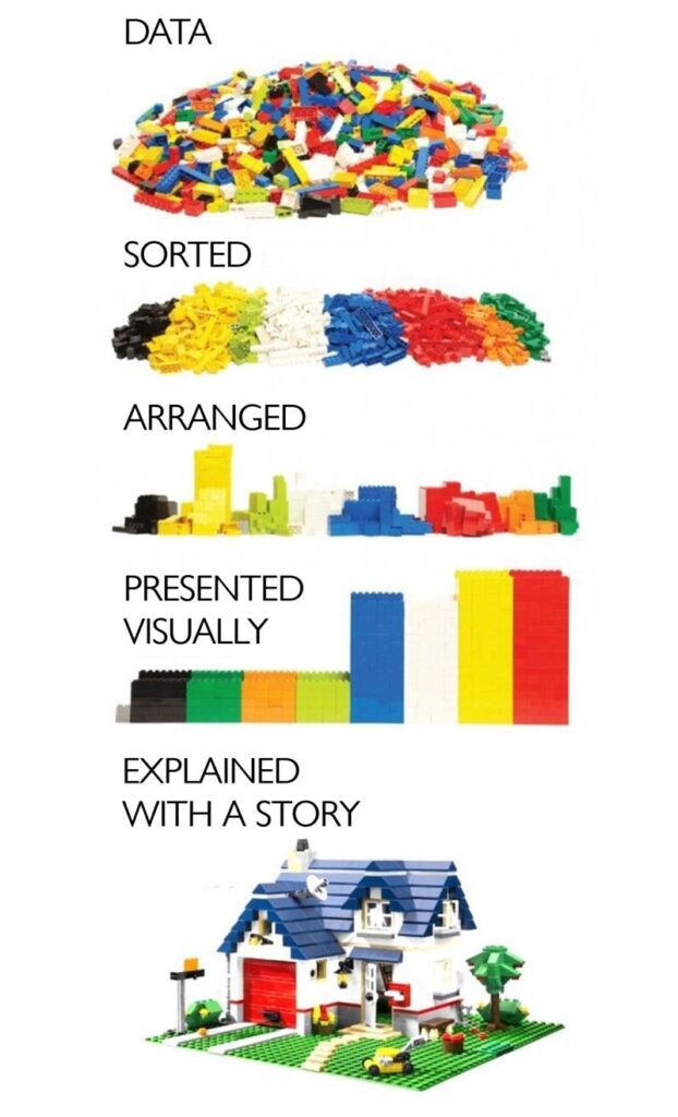
Imagine you conducted a survey and received thousands of responses. Keep in mind that the purpose of these responses is not amusement. As a business executive, you rely on the data for valuable insights. However, the same data is obviously confusing in its raw form, so you’ll need it translated into a language that you can understand and find visually appealing. Needless to state that you are at the risk of messing the whole data up if you, a non-data expert handles the raw data. This is where data analysis comes in.
Survey data analysis, according to Qualtrics, is the “process of turning the raw material of your survey data into insights and answers you can use to improve things for your business”. It is also concerned with recognizing, describing, and clarifying patterns. Survey analysis is useful because it enables you to draw broader conclusions about your target audience.
Overcome the challenges of data analysis and visualization with the power of Survey54
You don’t have to worry about being stressed out by the raw data gathered from surveys because a team of expert data analysts and data scientists will be on hand. They clean, analyse, and present data in straightforward, yet professional ways that only experts can. They provide a detailed breakdown of your survey raw data in graphs and charts. If you want, you can also compare the raw data in an excel file to the visualised report.
Survey data analysis simplified
A thorough analysis of survey data is essential for obtaining the information and insights required to make better business decisions. However, it is critical to be aware of potential obstacles that may make analysis more difficult or even skew results.
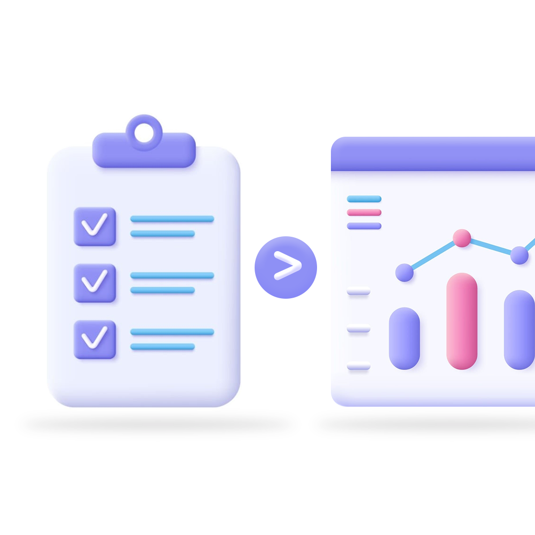
Self-serve survey dashboards make it simple to transform raw data into actionable insights presented in simple formats.
With automatic charts and graphs, your data gains life. Ai-empowered dashboards provide a real-time summary of how people feel based on thousands or even millions of anonymously collected responses. You can review positive, neutral, and negative sentiments at a glance or filter by perceptions to identify areas that require attention. Consider the possibility of converting all of those text responses into a quantitative data set!
How graphs and tables help with data analysis
When you want to quickly illustrate the results of your data analysis in a way that anyone can understand, graphs can be a great tool to use. Expert analysyts make it simple by creating graphs that add clarity and context to your analysis, allowing you to use the data in more tailored and actionable ways.
Cross tabulations, also known as crosstab reports, are another helpful tools for delving deeper into your data. Crosstabs organize your data into a table that classes respondents based on common background information or survey responses, enabling you to compare the responses of each group to one another. This allows you to better understand each group of respondents and how they differ from one another.
Survey54 makes data interpretation and visualization seamless for African businesses
If you’ve ever tried to visualize survey results using traditional charts, you probably may have encountered a slew of issues and roadblocks. Some of these obstacles may be difficult to overcome. That’s because survey data can be tricky if you don’t use the right type of visualization.

At Survey54, we have expert data analysts who know their onions and can professionally present insights in an easy-to-understand pattern. They have years of experience assisting companies with data coding, data cleaning, and data analysis. They also present a detailed and personalized report based on survey results. The report makes professional recommendations on the next steps for businesses based on observations. The reports are also downloadable in PDF and spreadsheet formats for administrative purposes.
Overcome the challenges of data analysis and visualization with the power of Survey54
One of the important features of our surrey reports are an objectively written Executive Summary. This is an independent observation and recommendation drawn from the survey findings. Every part of the report tells a unique storyin clear and concise manners.
Enough with conducting surveys whose results are difficult to comprehend. Start making informed decisions by leveraging clear and concise data visualization today. Contact Survey54 for the expert assistance you require.